Azure Product Illustration
Illustration . Product Design

Thematic Illustration
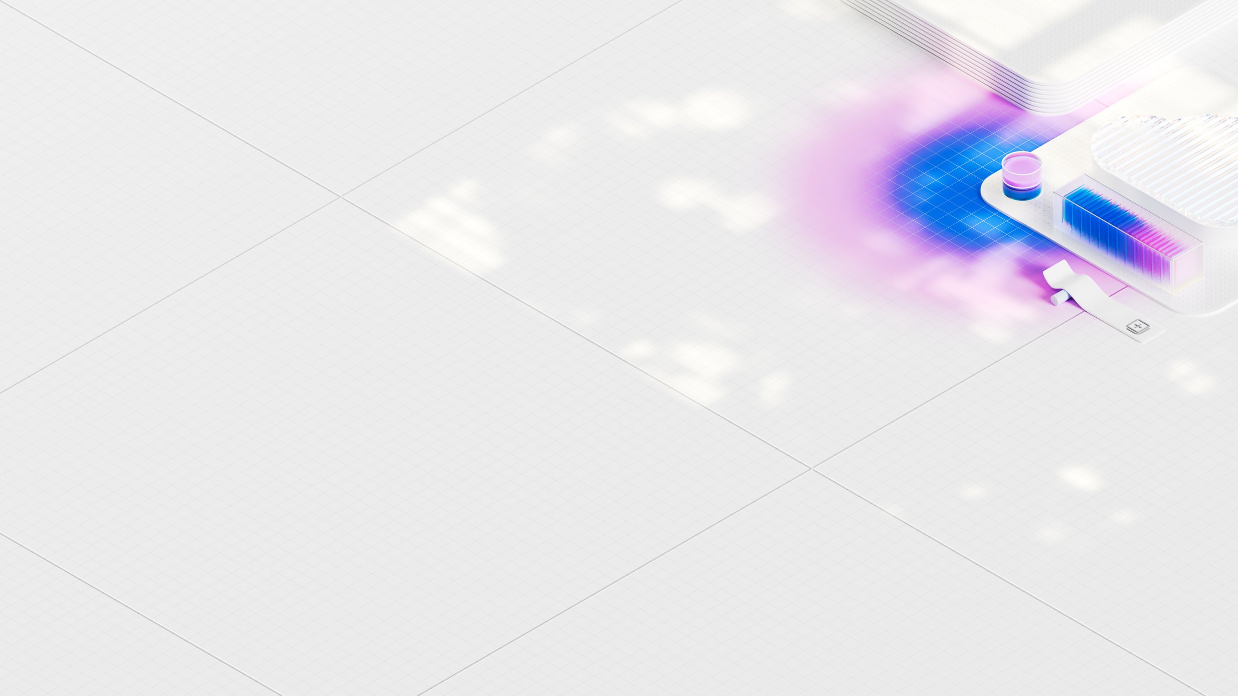
As part of an evolution in the Azure product, I worked on background illustrations that could work behind and with the Azure homepage workspace. The project also involved small spot illustrations for first run experiences, and other instructional spots that were also executed in 3D.
Homepage backgrounds
Using background art on the Azure product homepage was something that had never been done before, but if it were to be done, required a great deal of balance and restraint. Azure users are creatures of habit and efficiency, but also deserved to be catered to and have their experience improved. Our goal was to create roll-based background art to highlight the strengths of our top user-based rolls.
First Run Experience
With a shift in product experience, the user needed to be aware of a change in location for the navigation, theming, and slight changes in how the hierarchy of the page looked overall, so they could find everything they needed.
Product Iconography
With adjustments being made to the overall product experience, iconography updates were necessary to evolve the navigation and communications. Product icons were simplified and modified to be more modern, colorful, and relate more to the specific product area to which they belonged.
Consolidation of products and services into “Hubs” drove the need to create hierarchy through the product experience. I created a size ramp that allowed us to have a T-1 approach at the Hub level, while simplifying the product journey in the TOC, and navigation. All icons sat in Figma as components, with instances and variables set up so our product designers could prototype with ease.
Design system


